
Gauge Cluster Chart with Arrow Indicator
When visualizing metrics like temperature, battery health, or sensor ranges, traditional charts often fall short. A Gauge Cluster Chart offers a more intuitive and visually expressive way to represent data — especially when combined with a precise arrow indicator.
In this post, I’ll walk you through how I built a custom gauge chart component using Shadcn Charts that includes an arrow-style indicator layered over a segmented radial chart.
🧠 What Is a Gauge Cluster Chart?
A Gauge Cluster Chart combines the semantics of a gauge — like those found on speedometers — with segmented clusters that represent data ranges or thresholds.
It’s especially useful when:
- You want to show thresholds (safe, warning, critical).
- You need a discrete range broken into bands.
- You want an arrow-style indicator pointing to a specific value.
🎯 Goals of the Custom Component
- Extend a radial bar chart into a full-fledged gauge cluster.
- Add an arrow indicator that dynamically points to the actual value.
- Keep the chart responsive and visually appealing.
🔧 Technologies Used
- React
- Recharts (
RadialBarChart,PolarAngleAxis,PolarRadiusAxis) - TailwindCSS (for styling and tokens)
- A bit of custom SVG math for the indicator line
⚙️ Component Overview
Here’s a full component:
Find code in Codesandbox
// components/gauge-chart.jsx
'use client';

import { ResponsiveContainer, RadialBarChart, RadialBar, PolarAngleAxis, PolarRadiusAxis, Label } from 'recharts';
import { ChartContainer } from '@/components/ui/chart';


const chartConfig = {
  a: {
    label: "a",
    color: "hsl(var(--chart-1))",
  },
  b: {
    label: "b",
    color: "hsl(var(--chart-2))",
  },
  c: {
    label: "c",
    color: "hsl(var(--chart-3))",
  },
  d: {
    label: "d",
    color: "hsl(var(--chart-4))",
  },
}

export const GaugeChart = ({ title, value, limits, ticks, unit, precision = 0}) => {
  const [start, end] = limits;
  const chartData = [{
    a: ticks[1] - ticks[0],
    b: ticks[2] - ticks[1],
    c: ticks[3] - ticks[2],
    d: ticks[4] - ticks[3],
  }]

  // If value overflows the chart limit, then we
  // simply show indicator at the end of the chart limit
  const indicatorValue = value <= end ? value : end;

  // Calculate the angle for the indicator line
  // Each unit (0-10) corresponds to 18 degrees (180/10)
  const degreesPerUnit = 180 / (end - start);
  const angle = 180 - (indicatorValue * degreesPerUnit);

  // Convert to radians and adjust for the correct orientation
  const angleRad = (angle) * (Math.PI / 180);

  const Indicator = ({ cx, cy }) => {
    const innerRadius = 60; // Slightly larger than chart's innerRadius to ensure visibility
    const lineLength = 25; // Total length of the indicator line
    const arrowSize = 10; // Size of the arrow head

    // Calculate the end point to be just before the inner radius
    const endX = cx + innerRadius * Math.cos(angleRad);
    const endY = cy - innerRadius * Math.sin(angleRad);

    // Calculate the start point by moving inward along the same angle
    const startX = endX - lineLength * Math.cos(angleRad);
    const startY = endY + lineLength * Math.sin(angleRad);

    // Calculate arrow points
    const arrowAngle = Math.PI / 6; // 30 degrees for arrow head
    const arrowPoint1X = endX - arrowSize * Math.cos(angleRad - arrowAngle);
    const arrowPoint1Y = endY + arrowSize * Math.sin(angleRad - arrowAngle);
    const arrowPoint2X = endX - arrowSize * Math.cos(angleRad + arrowAngle);
    const arrowPoint2Y = endY + arrowSize * Math.sin(angleRad + arrowAngle);

    return (
      <g style={{ isolation: 'isolate', mixBlendMode: 'normal' }}>
        <line
          x1={startX}
          y1={startY}
          x2={endX}
          y2={endY}
          stroke="#404040"
          strokeWidth={3}
          style={{ zIndex: 1000 }}
        />
        <path
          d={`M ${endX} ${endY} L ${arrowPoint1X} ${arrowPoint1Y} L ${arrowPoint2X} ${arrowPoint2Y} Z`}
          fill="#404040"
          style={{ zIndex: 1000 }}
        />
      </g>
    );
  };

  return (
    <ResponsiveContainer width="100%" height={150} className="text-center">
      <h3 className="text-sm text-foreground font-semibold">{title}</h3>
      <ChartContainer
        config={chartConfig}
        className="mx-auto aspect-square w-full max-w-[250px]"
      >
        <RadialBarChart
          data={chartData}
          startAngle={180}
          endAngle={0}
          innerRadius={70}
          outerRadius={130}
        >

          <PolarRadiusAxis tick={false} tickLine={false} axisLine={false}>
            <Label
              content={({ viewBox }) => {
                if (viewBox && "cx" in viewBox && "cy" in viewBox) {
                  return (
                    <>
                      <Indicator cx={viewBox.cx} cy={viewBox.cy} />
                      <text x={viewBox.cx} y={viewBox.cy} textAnchor="middle">
                        <tspan
                          x={viewBox.cx}
                          y={(viewBox.cy || 0) - 16}
                          className="fill-foreground text-xl text-foreground font-bold"
                        >
                          {value.toFixed(precision)}
                        </tspan>
                        <tspan
                          x={viewBox.cx}
                          y={(viewBox.cy || 0)}
                          className="fill-foreground text-xs text-foreground"
                        >
                          {unit}
                        </tspan>
                      </text>
                    </>
                  )
                }
              }}
            />
          </PolarRadiusAxis>

          <PolarAngleAxis type="number"
            axisLine={true}
            tickLine={true}
            tickSize={-40}
            domain={['auto', 'auto']}
            tick={{ fill: "#404040", fontSize: 12 }}
            ticks={ticks}
          />

          <RadialBar
            dataKey="a"
            stackId="a"
            fill="var(--color-a)"
            className="stroke-transparent stroke-2 relative"
          />

          <RadialBar
            dataKey="b"
            fill="var(--color-b)"
            stackId="a"
            className="stroke-transparent stroke-2"
          />

          <RadialBar
            dataKey="c"
            fill="var(--color-c)"
            stackId="a"
            className="stroke-transparent stroke-2"
          />

          <RadialBar
            dataKey="d"
            fill="var(--color-d)"
            stackId="a"
            className="stroke-transparent stroke-2"
          />
        </RadialBarChart>
      </ChartContainer>
    </ResponsiveContainer>
  );
};
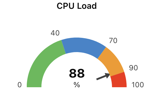
Here’s an example using the component:
<GaugeChart
  title="CPU Load"
  value={88}
  unit="%"
  limits={[0, 100]}
  ticks={[0, 40, 70, 90, 100]}
  precision={0}
/>
This render:
- A gauge segmented by performance zones.
- A needle pointing to 88%.
- Centered numeric display (88%).
🎨 Styling
- All styling is managed via TailwindCSS tokens.
- Color segments use custom CSS variables (e.g.
--chart-1). - The layout is mobile-friendly thanks to
ResponsiveContainer.